
This year is my second Pride Month. And while we do this every year in protest so people and governments around the world know that we exist and we deserve the same human rights afforded to others, it is also a celebration of diversity for the LGBTQIA+ community. And celebrations are an excuse to dress up, so I did! This redesign really started with the outfit I am going to wear to the Pride March. After seeing the photos, it was a revelation, and I felt my creative juices boiling over; it is indeed time for a redesign.
The previous design was also borne out of a photo shoot. Photos, and the basis of the design, was from my new year’s photo shoot, courtesy of A Studios. It was my first photo shoot dressing up like that, and the photos felt authentic to who I am as a person. That photo shoot was deliberately for the website. I needed some good graphics to make my website stand out while also showing a glimpse of who I am in person to everyone visiting.

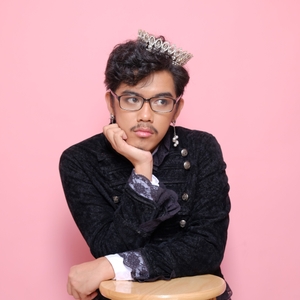
The same can be said about this edition. But while the first shoot showcased a gentle and bubbly prince-type personality characterized by soft pinks, this new edition explores a darker side. It is characterized by dark harsh reds, characterized by roses and red flourishes. I’m also wearing a mesh shirt that looks like snake skin from afar. In this edition, I am channeling my pop star royalty dreams. I’ve always fantasized about being an international pop star, along the lines of Lady Gaga, a personal hero of mine, as well as Beyonce, Katy Perry, and Rina Sawayama. This redesign is a realization of that fantasy, as absurd as that may sound.
Inspirations and process
Off the bat, I wanted the theme to be red. This is a transition to a darker vibe, like a reverse of Taylor Swift’s transition from the reputation era to the Lover era. Red also reminds me of destructive magic from witchcraft (yes, this is a Wanda Maximoff reference), especially the darker tones. From my head dress which are characterized by teardrop gems hanging from gold strings and chains, I wanted to channel a diwata and make a reference to the babaylans, who were ancient Filipino priestesses who accepted queer people into their ranks. As you may imagine, this pool of inspirations is highly feminine.

My usual design process often starts this way. I gather a bunch of inspirations, and I go to Figma to build some mockups of what I think I like. Fortunately, my website is first and foremost a creative expedition before it is a marketing strategy, so I don’t have to worry that much about retention and clicks from potential recruiters and employers. After having an initial design, I leave Figma to the side and start coding. This is where the bulk of the work resides. Being a developer, I tend to design in the browser at this stage, and any modifications to the design, I do it in the browser’s developer tools. Firefox is my browser of choice because it has a set of developer tools that I don’t feel like it’s fighting me rather than working with me.
At this stage, I fire up my website repository. My website is built with Eleventy, so I just fire up a terminal and run a local dev server. Currently, this website is hosted on Netlify, so I
run netlify dev so it runs on my local machine the way it runs on Netlify’s servers.
I don’t have a clearly defined system of turnover of design assets. Since I am my own designer and developer, I can just do whatever I want. Most of the time, I move from Figma to code, and only export all of the needed assets when I reach the part when I have to code with the images. I host my images on ImageKit on a free plan.
Elements
In the previous design, my name acts as the title of the website, and underneath it runs three main roles I have in my career: web developer, web designer, and educator, in that order of frequency. In this current design, I decided to go a different way. Firstly, I pushed my name in the background. I wanted to emulate a magazine cover, so I put it beneath my image so it gives off an overlap situation. I got this habit of getting inspiration from print design by watching Layout Land by Jen Simmons, which is now easier thanks to advancements in CSS.
I also wanted to contextualize my career roles. In this design, I broke up the three career roles into their own respective boxes and added years of experience in all of them. Immediately upon landing on the page, if you are a recruiter, you would immediately see how long I’ve been working as a developer, designer, and educator, and by seeing my years of experience on the get-go, you’ll have an idea of my proficiency in these respective roles.
For the calls to action, I put them at the bottom of the screen. In this design, I am channeling the macOS dock, which is a piece of UI component that I’ve always been in love with since the day I first saw it. I always emulate it in all the Linux distros I’ve tried, and now, I am emulating it in my website.
If you are viewing the banner in a wide-enough screen, you will see that I included a bunch of words written in an unusual script. If you are Filipino, you will recognize that these are Baybayin characters, an orthography used by pre-colonial Filipinos, particularly those in Luzon area. This orthography has seen a renewed popularity with the Gen Z, and I am definitely riding the hype. As I mentioned previously, I wanted to channel the diwata and the babaylan, treating them as personal icons of queerness. I added these words as a reference to magical and protective runes used in witchcraft and sorcery. They actually mean something: kalayaan (liberty), pagkakapantay-pantay (equality), and karapatang pantao (human rights). These are beautiful things, and I added them here to do exactly that—to make things beautiful. I am also treating it as a manifestation of sorts, especially with the Pride Month happening, these three are the things I want the most for everyone, especially for my people.

The current design has (1) my career roles accompanied by my respective years of experience; (2) words written in Baybayin script; and (3) the calls to action emulating a macOS dock.
The cover also changes its layout depending on the viewport width. I know, that’s not groundbreaking, but I just wanted to let you know. A good chunk of my design time was dedicated to digging into the 335 photos from the shoot for the three perfect images to put as cover for the screens. Also, the layouts are responsive to viewport height, too, if only to make everything except the title, the image, and the calls to action disappear so the layout doesn’t look broken.


Depending on the size of the viewport, the layout and the cover image changes accordingly.
Conclusion
I had a really great time doing this entire thing, and I only finished it in two days, so I wanna give a shoutout to myself for slaying that. I have been relearning Spring Boot recently, and building projects with it, and as much as I am enjoying that (because I am enjoying it so much, and my workplace is giving me enough liberties around that project), that is highly logical and I am missing a little bit of my creative side. I can say that this is a very productive and worthwhile effort.
But also, I also want to give a shoutout to every queer and trans kid all over the world who, right now, are fighting battles bigger than them. While we have come a long way as a community, we are still being killed left and right. Trans people are still not being afforded rights as simple as going to a restroom where cisgender people aren’t thinking they are going to get sexually harrassed. Even worse, trans people are being forced to detransition after many years of working hard just so they could be comfortable and don’t feel like they want to die. The battle is far from over, and it may not be over within our lifetime, but I know every effort piles up, and a time is coming when we no longer need a month for Pride.
A side-by-side look at the previous and current design.