

CSS grid is a monumental new feature for CSS. Along with Flexbox, it gave us—finally—a way to lay out our pages without the need for hacks or frameworks; the layout framework is built into the browser itself. And the fact that it came out to all browsers within a month of each other is even better because we can use it as soon as possible.
CSS Level 2 is called subgrid. It is an addition to the original CSS grid spec, and it makes it even more powerful
Note You have to be familiar with CSS grid first to understand what subgrid is. If you have no idea what I am talking about, MDN Web Docs and CSS Tricks have an awesome introduction to it. CSS Grid by Example
Browser support
Upon looking at Can I Use? as of time of writing, subgrid is unfortunately only supported in Firefox 71 onwards. This is because the subgrid spec is still in the working draft stage. But don’t fret, that doesn’t mean subgrid is going anywhere. We just need to wait more until the CSS Working Group figures out everything about this very neat CSS feature.
Still in for the ride? Cool, let’s look at how subgrid works.
What is subgrid?
In CSS level 1 (the original CSS grid), we can turn an element into a grid container by giving it a
display of grid. This in turn makes its children grid items that can align to the rows and columns of the container:
<div class="grid">
    <span>I am a child of .grid</span>
    <span>I am a child of .grid</span>
    <span>I am a child of .grid</span>
    <span>I am a child of .grid</span>
    <span>I am a child of .grid</span>
    <span>I am a child of .grid</span>
    <span>I am a child of .grid</span>
    <span>I am a child of .grid</span>
    <span>I am a child of .grid</span>
</div>
.grid {
display: grid;
grid-template-columns: 1fr 1fr 1fr;
grid-template-rows: 1fr 1fr 1fr;
}See the Pen CSS Grid by Francis Rubio (@maniczirconium) on CodePen.
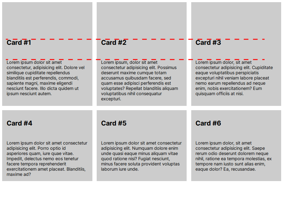
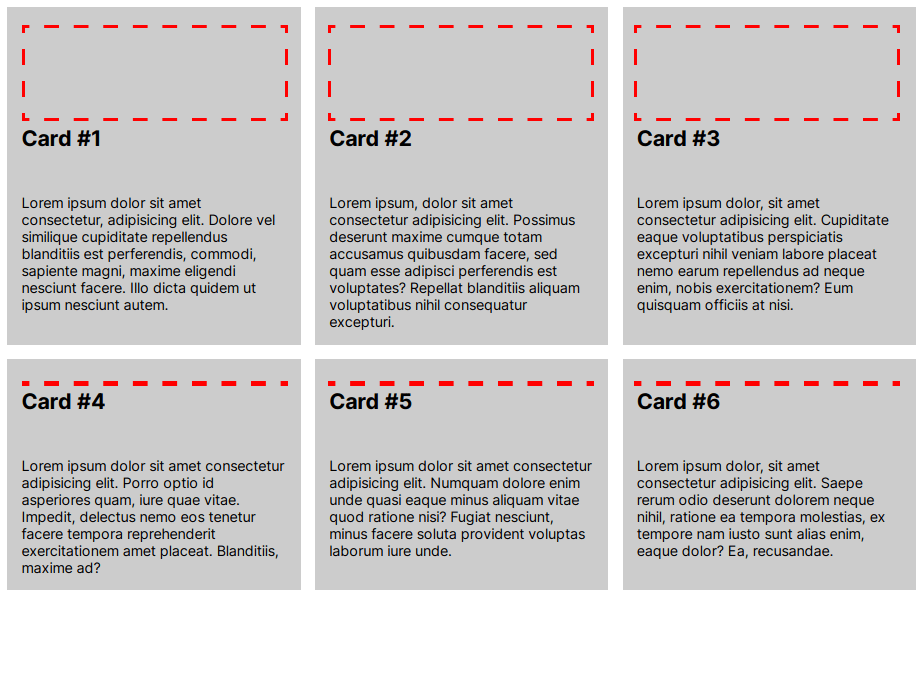
This is in and of itself very powerful. It is unlike anything we have seen on the Web before. However, things could definitely be improved. Look at the following cards example where the cards align to the grid tracks, but their children don’t.
See the Pen Cards with no subgrid by Francis Rubio (@maniczirconium) on CodePen.
We will see in the next image that the container’s immediate children, the .cards, align to the container’s grid tracks. The cards’ contents, however, do not align, as is shown
by the red dashed lines.

We could fix this by assigning fixed height to the cards’ contents. This however would not be ideal in cases where the length of the content is unknown. This is where subgrid comes in.
Basically, subgrid is a new addition to CSS grid where grid items can inherit their parent’s grid tracks, both rows and columns. Using subgrid on our example, we can align those paragraphs and headings with each other, even when we don’t know how long the content would be.
Visualizing subgrid
The process of designing websites can vary for every designer, but I design on the browser by writing some prototype code and modifying it via the browser’s developer tools. One thing I found very useful, however, is designing it first on a design tool like Figma[1]. So let’s do that.
Visualizing a grid can be very easy. Visualizing a subgrid, however, is more complicated. Let’s start with a simple grid that will host our cards. In our previous example, this is what our grid looked like:

Let’s now add the additional rows that the individual cards will use to lay their contents out:
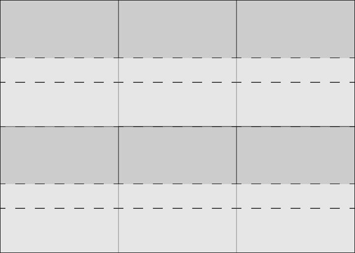
When we use this later on in our code, this is what it’s supposed to look like, roughly:
With this design, we expect it to align our cards and their contents with each other, regardless of how long or short the contents are.
Coding the grid
As usual, we still use display: grid to make the container a grid container and turn its direct children into grid items. We will also just use the column templates from our
previous examples since nothing changed in our columns. We are still using our previous example’s HTML code.
.grid {
    display: grid;
    grid-template-columns: 1fr 1fr 1fr;
}
Now, we’ll setup our rows. Let’s go back to our grid design and figure out the measurement of each row. To make this simple, we’ll only look at the first three rows.
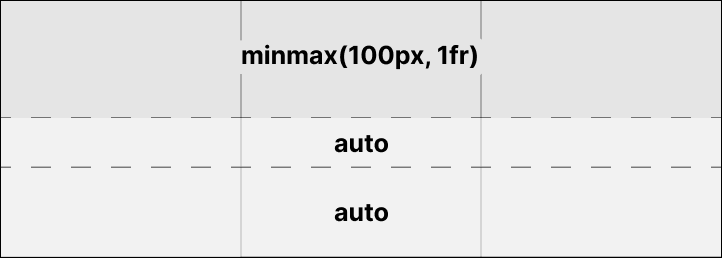
We are making the first row minmax(100px, 1fr) to make it take up the most space, since that is for our image, but also give it a minimum height of 100px. We are
making the second and third rows auto because we want them to resize to the content we have. Let’s make put it into our code.
.grid {
    display: grid;
    grid-template-columns: 1fr 1fr 1fr;
    grid-template-rows: 1fr auto auto;
}
We will then make the cards span those three rows. We’re giving each card three rows since our content will align to those three rows. We will also make it a grid container using
display: grid;.
.card {
  display: grid;
  grid-row: span 3;
}
And now for the exciting part: instead of assigning a custom row template for the cards, we will instead use the subgrid value. This tells the browser to use the rows of the
parent container to lay out the contents of our card:
.card {
display: grid;
grid-row: span 3;
grid-template-rows: subgrid;
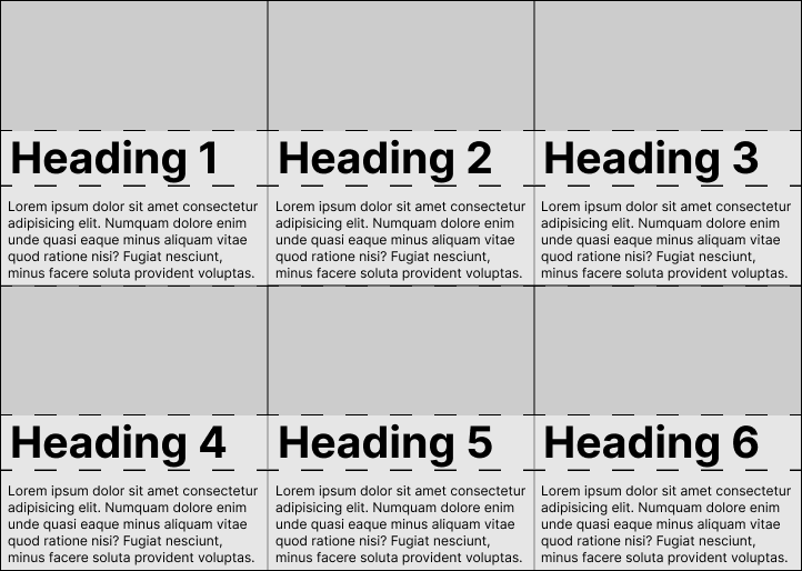
}This is what that looks like now:
See the Pen Cards with subgrid by Francis Rubio (@maniczirconium) on CodePen.
Now the cards are also using sort of a copy of the parent’s grid rows. Because of this, the browser is also laying the headings and paragraphs out in the same grid rows that the cards are using:
However, you will notice that the second row of cards are quite shorter than the first ones. This is because from the second row onwards, our grid does not honor our
minmax(100px, 1fr) and instead uses auto. This is because grid-template-rows only works one time—the browser uses auto for every other
automatically generated rows that we haven’t declared in grid-template-rows.
To solve this problem, we will go back to our .grid container and use the property called grid-auto-rows instead. This will tell the browser to reuse our row
template whenever it creates new rows:
.grid {
    display: grid;
    grid-template-columns: 1fr 1fr 1fr;
    grid-auto-rows: 1fr auto auto;
}
See the Pen Cards with subgrid (with grid-auto-rows) by Francis Rubio (@maniczirconium) on CodePen.
Making it responsive
We can make this responsive by using the minmax() syntax on the .grid container. Instead of using 1fr 1fr 1fr to specify three equal-sized columns, we
will use repeat() to tell the browser to fit whatever number of cards can fit into the current size of the container:
.grid {
  display: grid;
  grid-template-columns:repeat(auto-fill, minmax(300px, 1fr));
  grid-auto-rows: minmax(100px, 1fr) auto auto;
  gap: 1em;
}
Jen Simmons has a really great video on the Layout Land Youtube channel that explains how this syntax works. But basically, it tells
the browser to fit as many cards as possible into our rows as long as each card is 300px or more. Let’s see what that looks like:
See the Pen Cards with subgrid (responsive) by Francis Rubio (@maniczirconium) on CodePen.
Try opening that in a new tab and resizing your browser if you are on a desktop or laptop computer. If you’re on mobile, you can try changing your orientation from portrait to landscape. You
will see that the number of cards in each row changes as the width of the container changes. That is because the browser is automatically laying the cards out and making them fit in a single
row, until there is no more space to accommodate all the cards without making them smaller than 300px.
Further reading
If you would like to learn more about CSS Subgrid, the CSS specifications are always the best place to go, since that is the ultimate source of truth about everything CSS. Just notice that the Subgrid spec is still in the Working Draft stage.
If reading the specs is too technical for you (like it is for most of us), you can take a look at MDN Web Docs’ article about CSS Subgrid. You can also watch these videos for more tasty treats about grids:
-
This is not a sponsored post. ↩︎